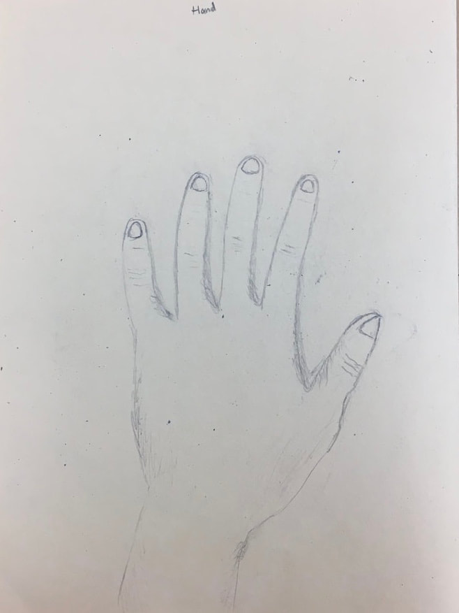
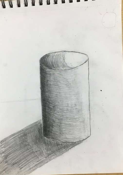
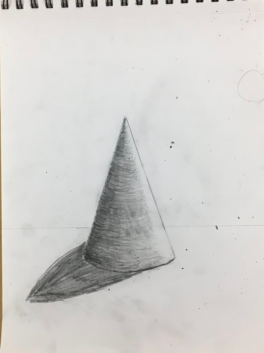
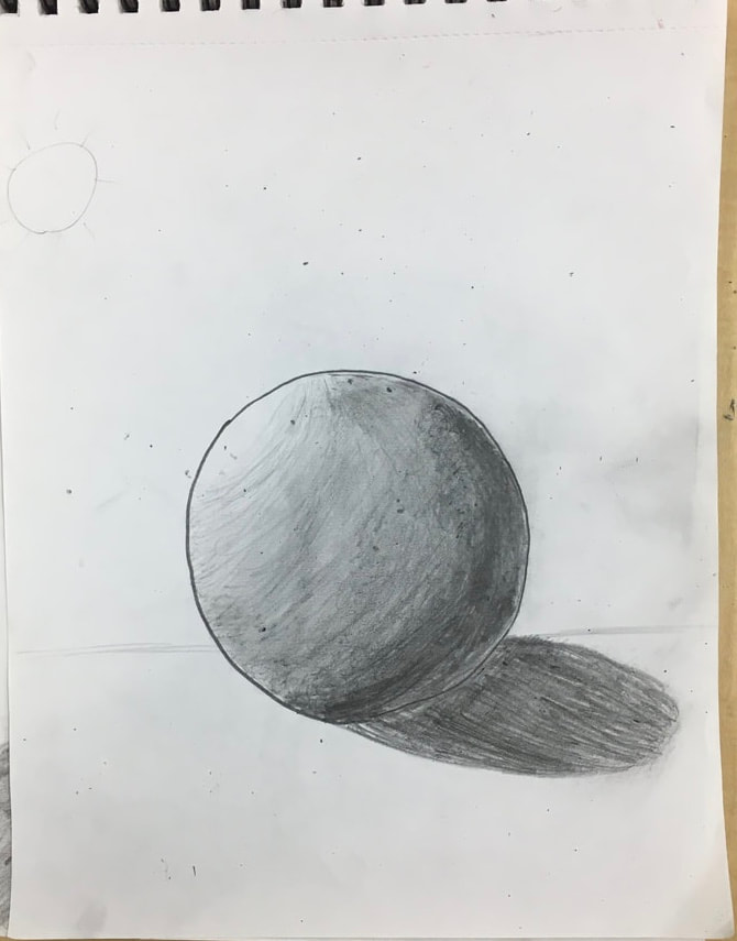
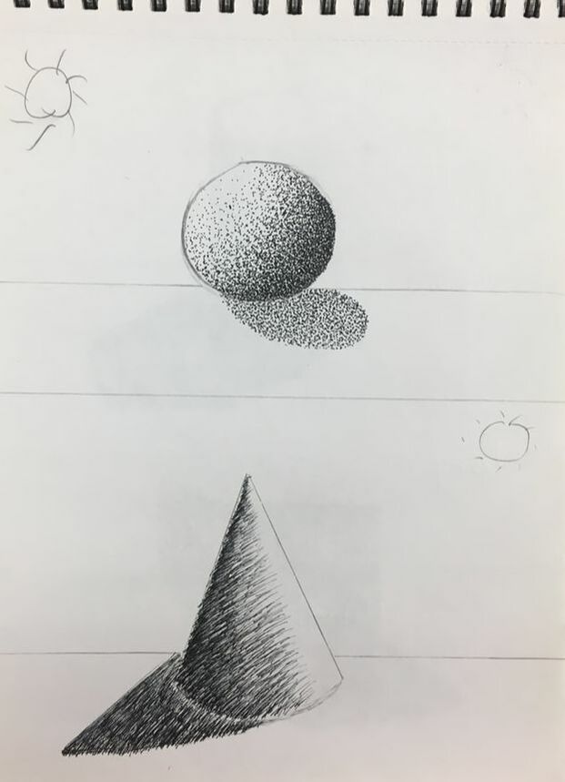
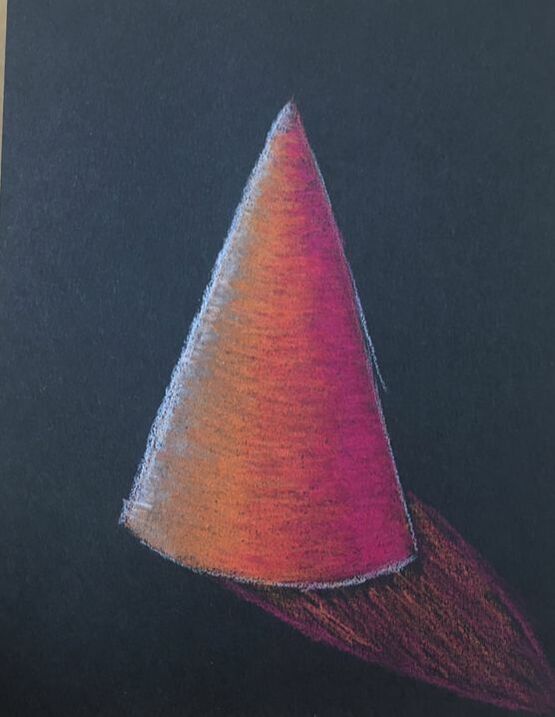
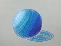
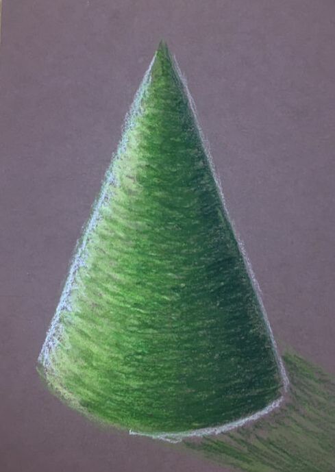
Here are my pictures of shapes where we started to learn how to shade. |
|
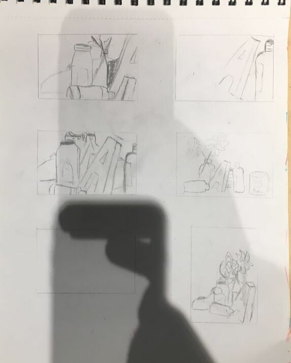
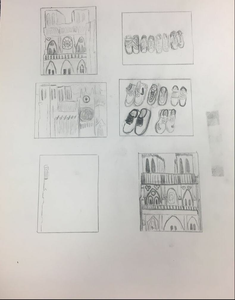
Still Life
These are my sketches for my still life. I struggled get the right sizing at first but on my fifth one it was finally good enough to draw.
|
|
|
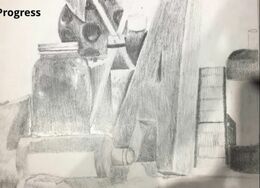
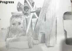
These drawings are in progress as I am adding more shading and defining the lines more on the objects. |
|
Final Art
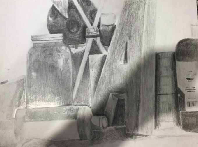
1. I arranged the composition of the picture so there was not one object that was the focus. I tried to get many objects at different ranges of size and shape in their and I feel as if it is pretty successful.
2. Yes I did use a wide range of values. Some areas are very dark (if there is a shadow or if the object is just simply darker). Some areas are lighter (if there is a glare on the object).
3. The practice with value before this project helped me tremendously since I had never done something like this before. Without the work before I would have been lost.
4.I feel like my blendning is decent but not consistent throughout the piece. I need more experience to fully grasp it. I used a 4B pencil for most of the darkest areas and an HB pencil for the lighter areas.
5. My interpretation of texture was helpful with the glass objects because they are clear and have lots of different shades in them. I felt like I showed texture on these objects pretty well to make them look round instead of flat.
6. If I could recreate my piece I would cut out a little bit of the left side because I feel like it is too empty. Also I would try to make the table and cloth that the objects are on more defined and realistic.
|
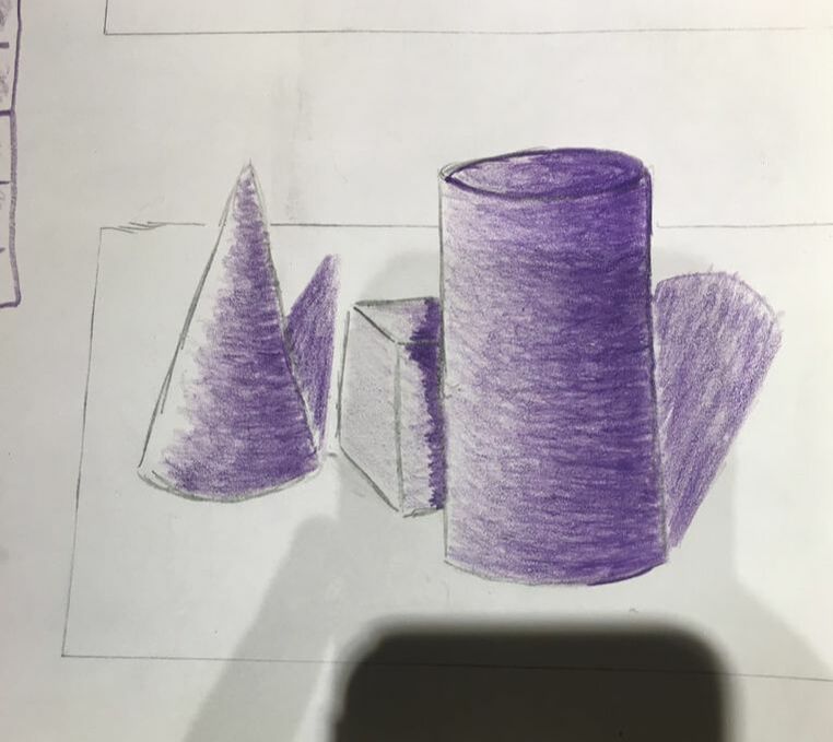
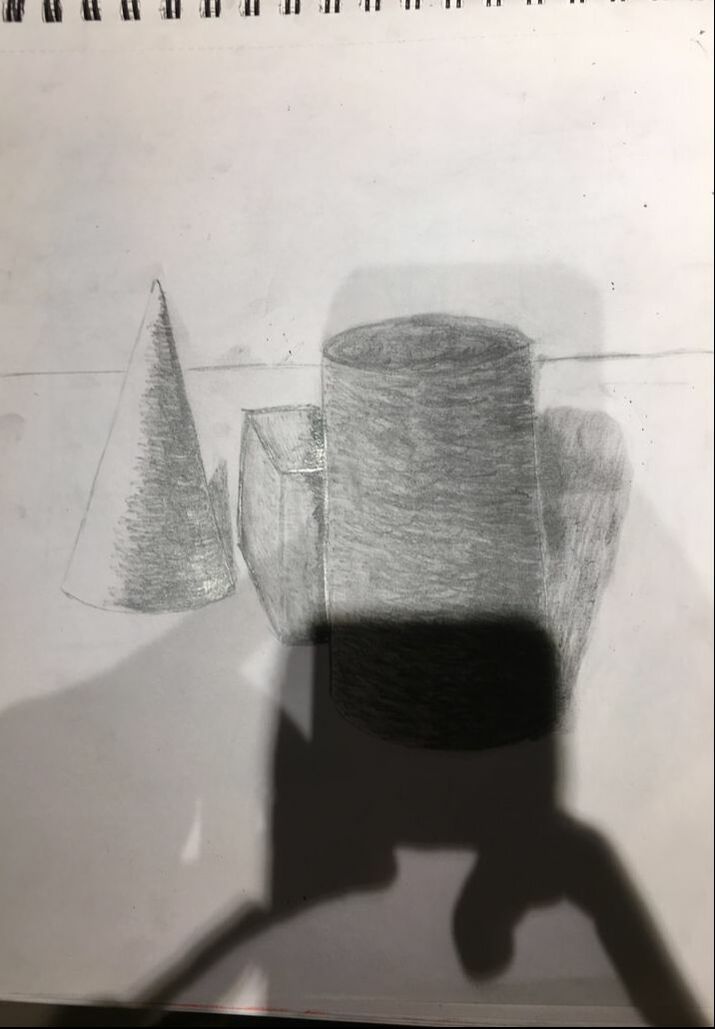
These are my Still Life pictures where I drew the shapes that were placed in front of me. One the bottom drawing I used pencil and shaded the shape and the shadow on the back. On the top picture I used a color pencil to show the value and shadow.
Pen and Ink Unit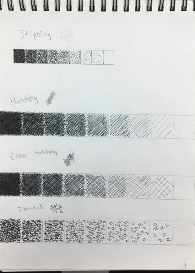
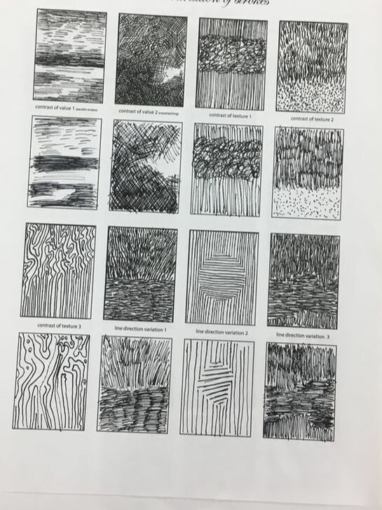
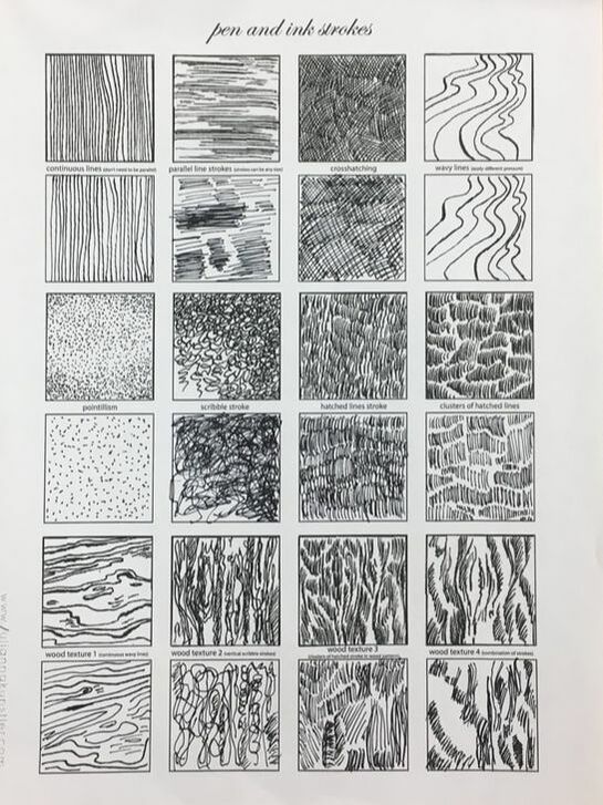
Value chart for the different textures that are important to know for pen and ink to show value.
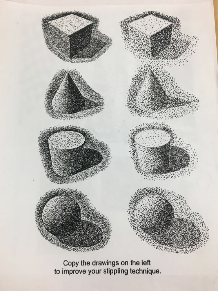
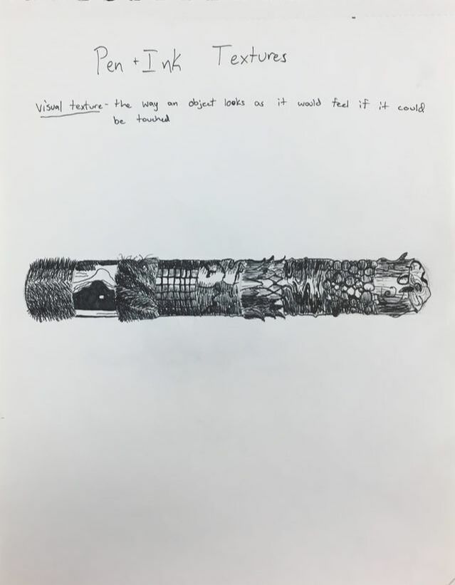
This picture and the cylinder were videos that we copied trying to learn how to draw textures onto 3D objects.
|
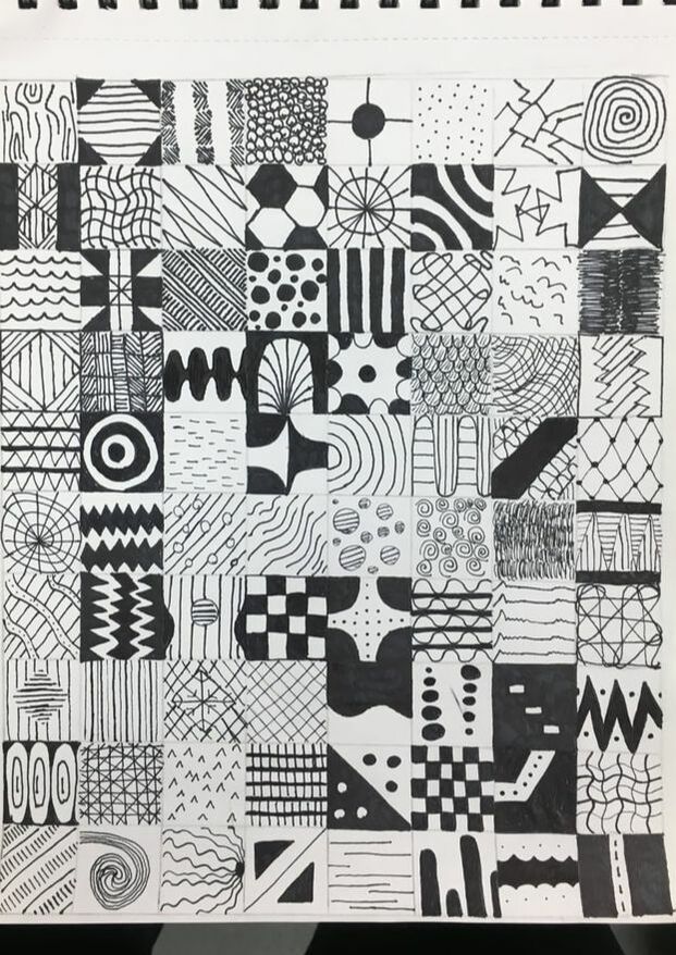
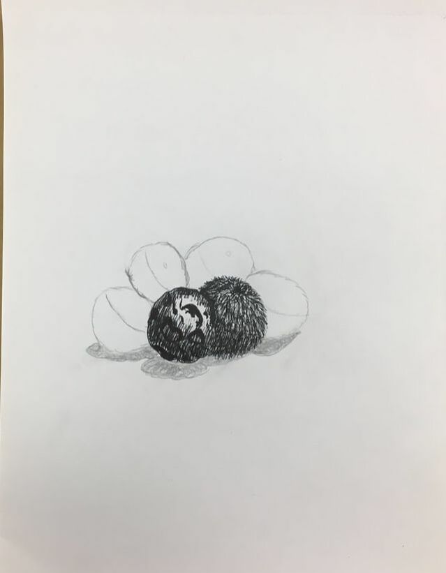
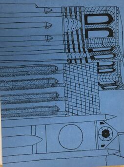
100 textures that we used as ideas to use on our pen and ink project.
|
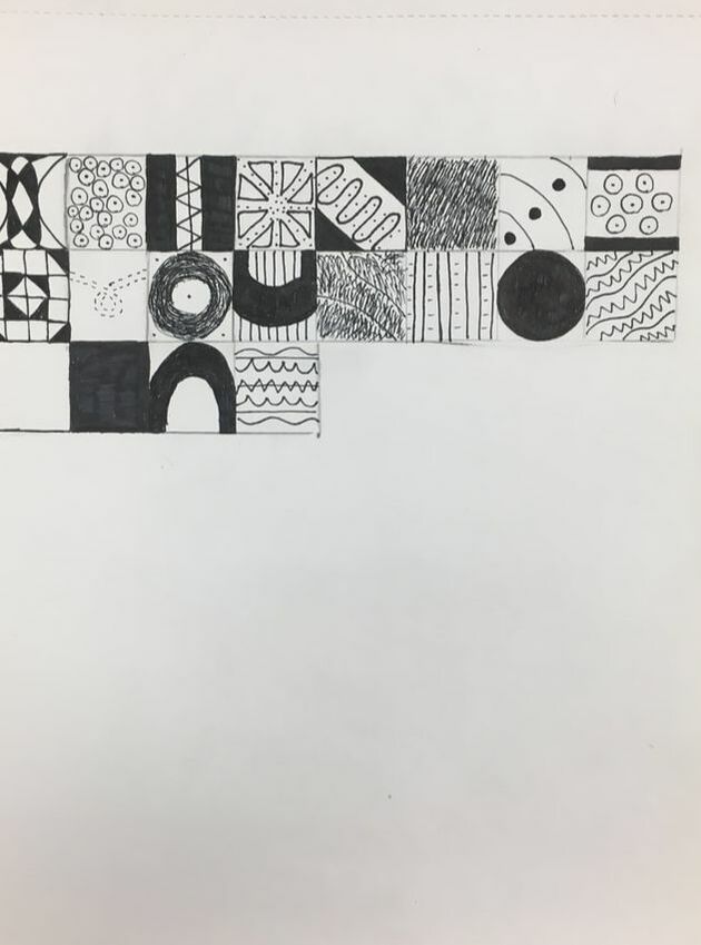
Sheet of textures that we copied the picture above.
Stippling practice to show value on objects.
|
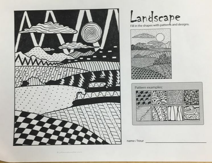
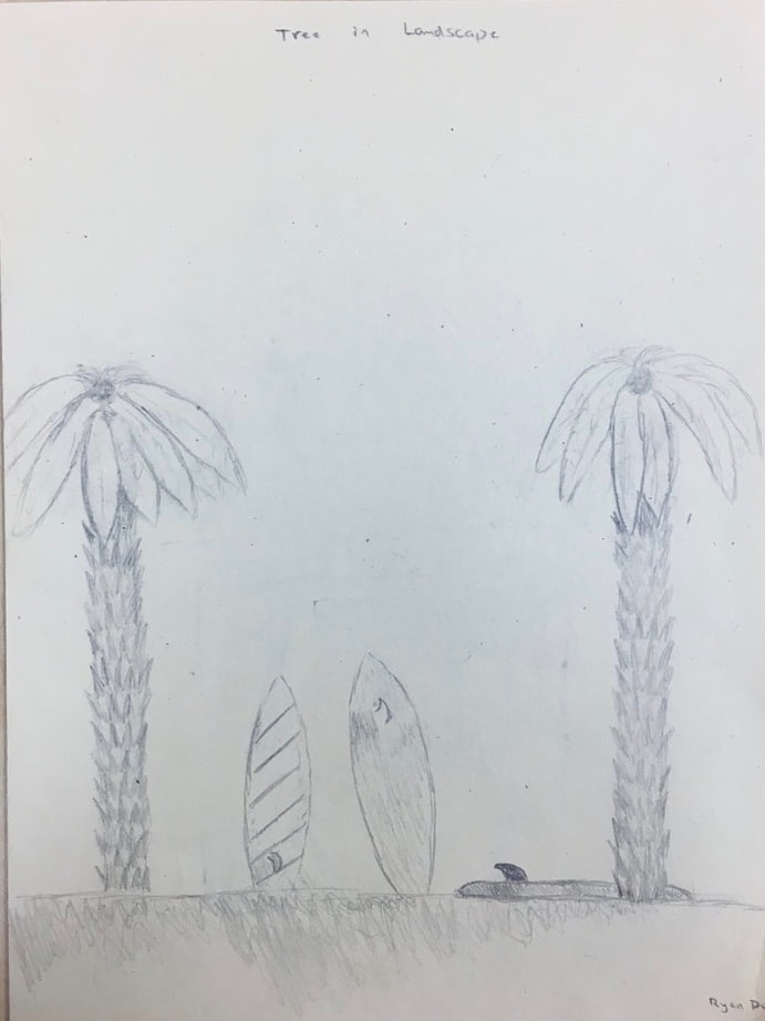
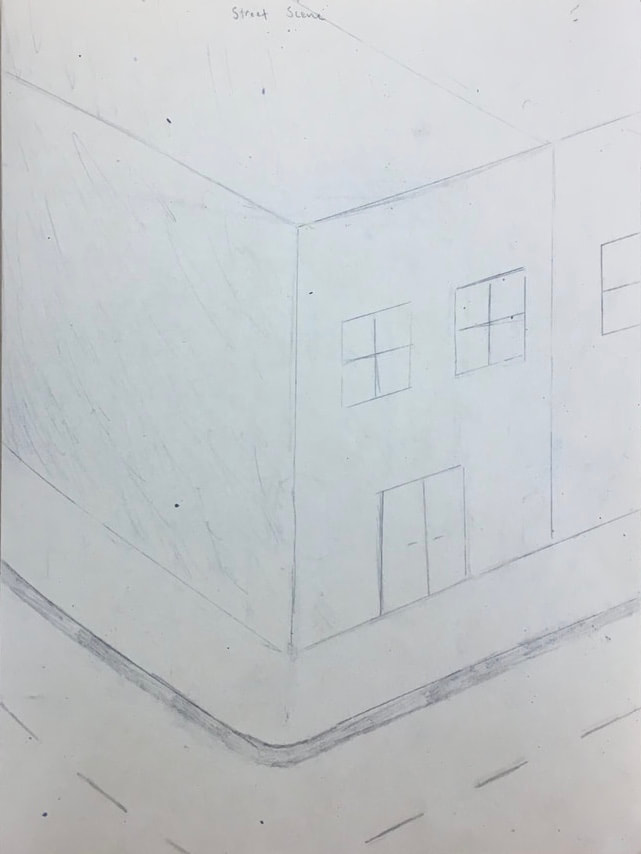
Landscape picture that we used as practice before we did the final pen and ink drawing.
|
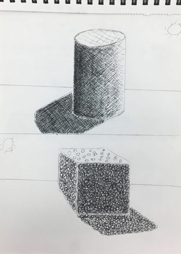
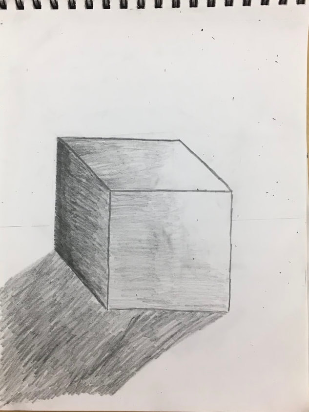
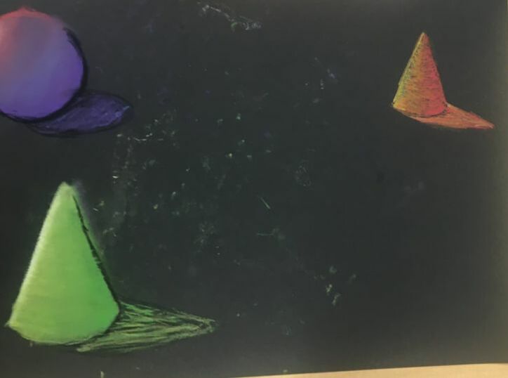
The cylinder, sphere, cone, and cube were practice using different textures to show value.
Pen and Ink in progress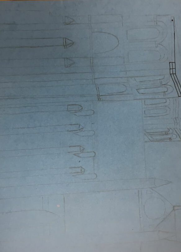
|
|
|
Pen and Ink Final
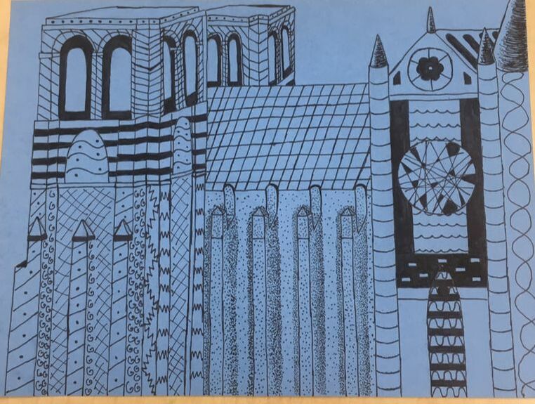
1) I feel as if I made a successful composition. I arranged it to show the important well known parts of the cathedral because the entire thing is big.
2)Texture and Pattern are both important. Pattern makes it more appealing to the eye and texture gives different areas of the building that are different building materials different looks.
3)Value is very important because it shows depth of the building. You dont want your drawing to look 2D.
4)My craftsmenship is decent. I feel like it was a good idea but I could have executed better.
5)The practice papers helped me a lot since I had no idea how to use pen and ink before this Unit. It helped me come up with ideas of where to put certain textures,
6)When using pen and ink you have to use the techniques to make it look good. If you do not use them it will look sloppy and the picture wont have any value
7)I learned from this project that if you arent really into what youre drawing you will struggle to find motivation to work on it. I think this will help me plan better next time.
8)If I could recreate my piece I would draw it from a different angle. There was a lot going on in this composition.
|
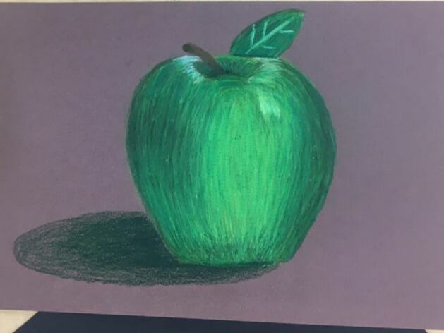
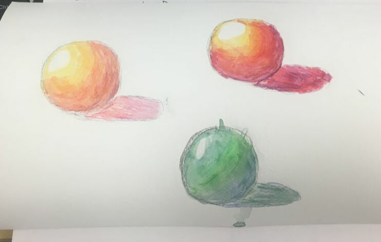
Here are all of my prisma colored drawings. We used them on spheres and cylinders at first to practice the blending of the colors and then we moved onto our final project with it which is the apple at the bottom of the row.
Final Project in progress |
Here is my prisma colored pencil drawing of the candy. This project I had a rough time showing value.
|
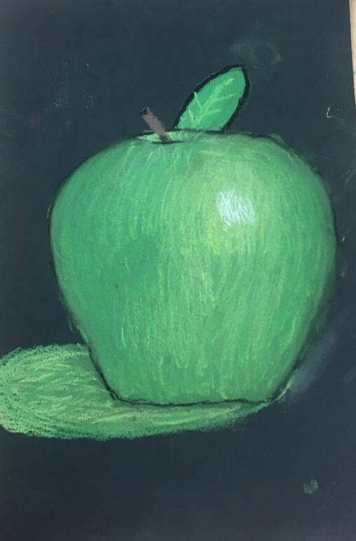
Pastel practice with spheres and cylinders and then the final is the apple drawing.
|
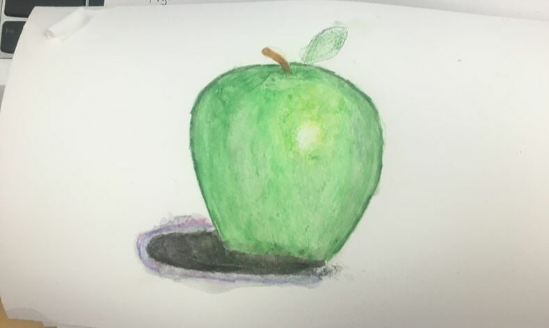
Started water color practice with spheres and then moved onto our water color final which is an apple.
|
final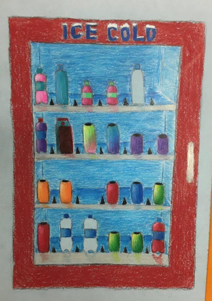
|
|
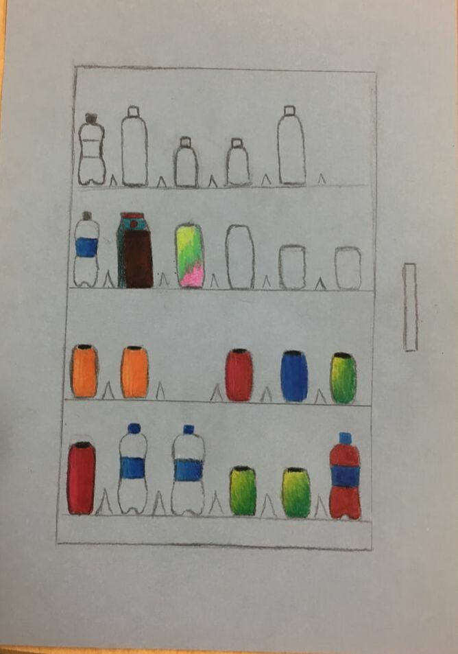
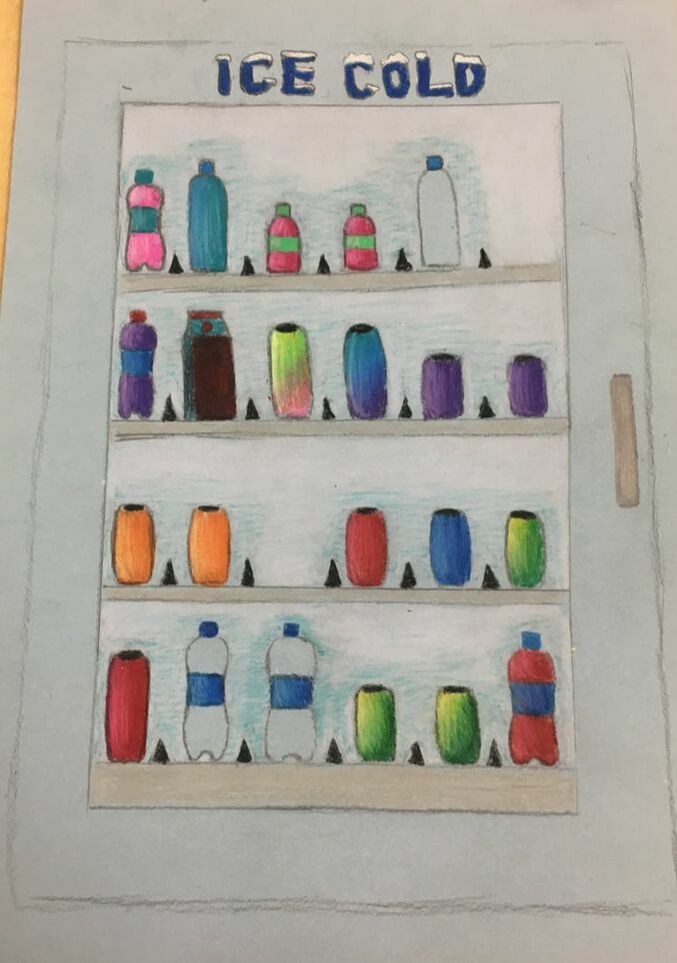
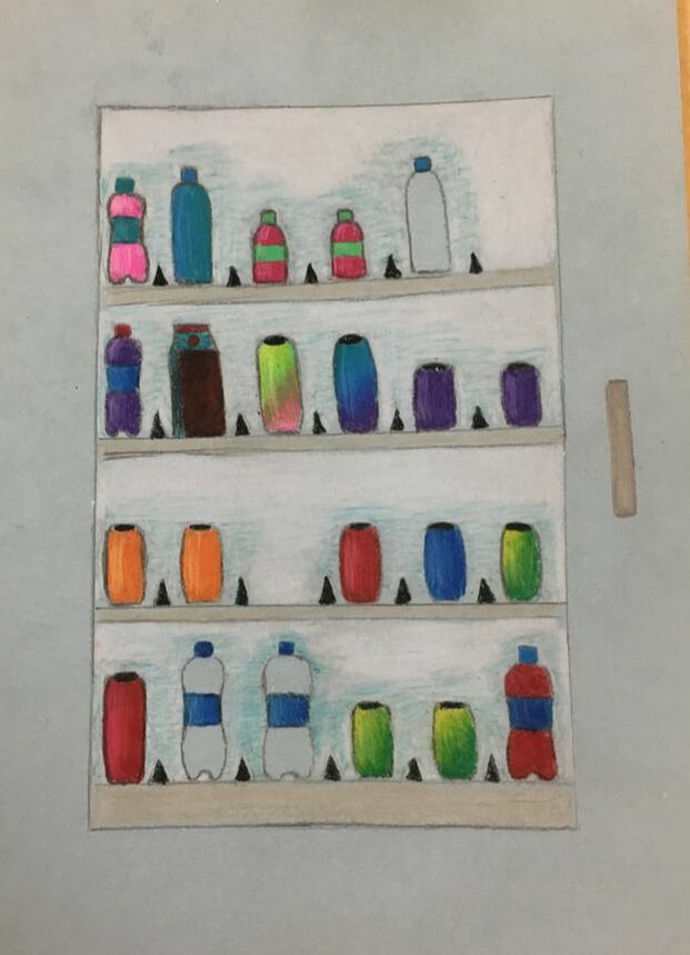
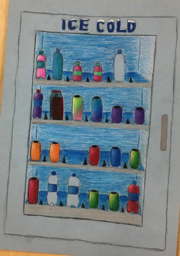
1) There is a good balance of objects and rhythm too. All the objects go well together and have good unity.
2)I used value in the back of the refrigerator to make it look like the drinks were sitting inside the cooler. It is very important, so it doesn’t look 2D.
3)Since I used exaggerated color the picture looks more fun and livelier. Without it it would be dull and boring since it is such a simple, plain thing to draw
4)The project is not bad, but it was tough to show depth in it because there really was not much. I could have made it look a little more realistic looking back on it.
5)Yes I was. You could see the back wall of the refrigerator. The drinks were in the middle ground, and the fore ground was the door to the refrigerator.
6)I had no real experience with colored pencils. The obstacles were learning how to blend them without it being obvious you used two different colors.
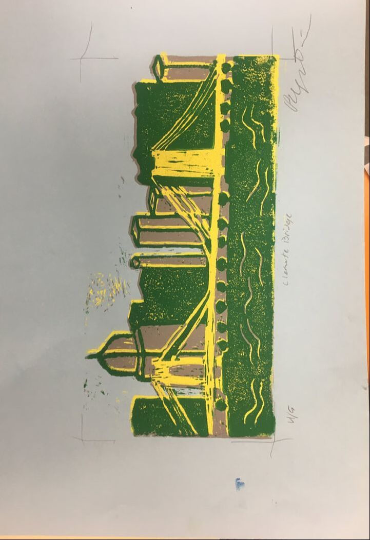
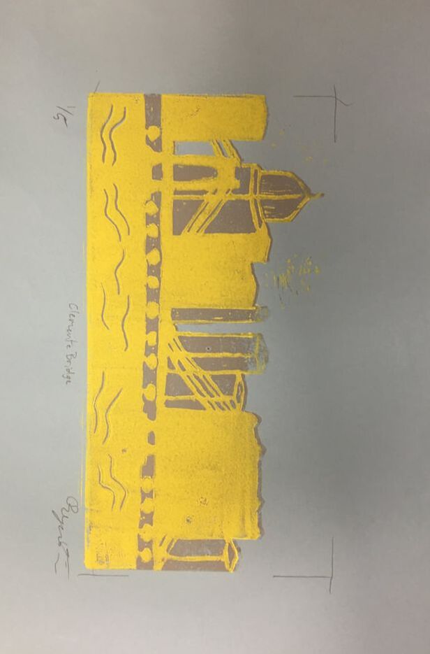
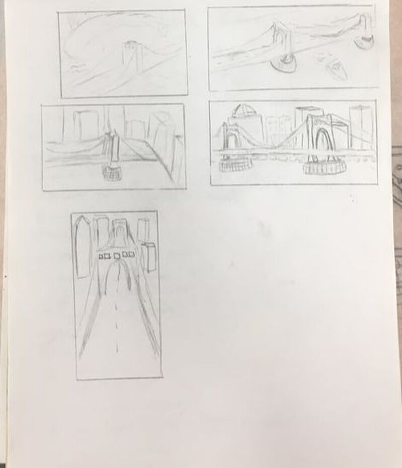
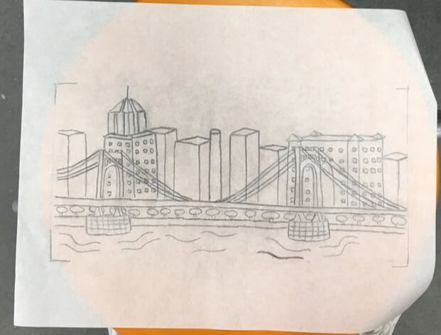
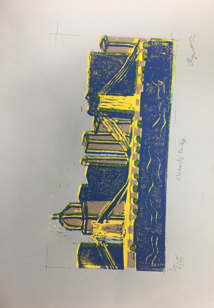
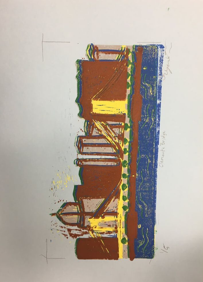
Print Making Project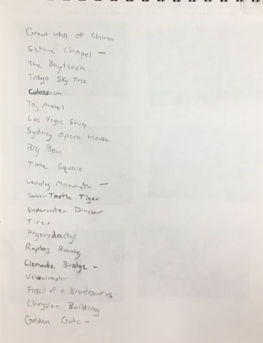
|
|
|
|
|
|
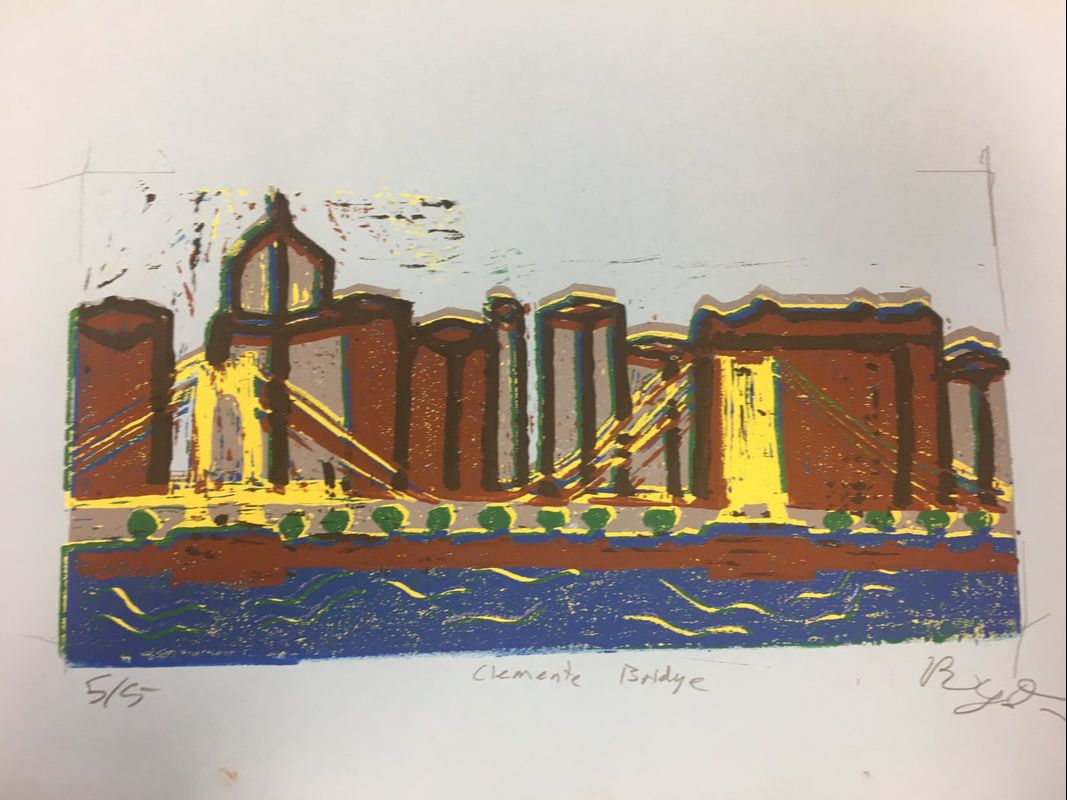
- Describe the craftsmanship of your prints. (How good the project is technically crafted)
I did a decent job at carving my prints. I messed up once by forgetting to cut something out.
-burnishing and ink coverage
I did fine with getting the color on the paper, but I messed up on the alignment of each print. I overlapped on places that shouldn’t have been overlapped.
2)How did you use texture, color harmony and balance to define your choice of subject?-texture
I cut lines in the water to show that the water had texture to it. Also I made lines to show the buildings coming out so they aren’t flat.
-color harmony
The colors look good on the paper. I should’ve made the yellow pop a little more to show that it is the focal point of the picture.
--balance
I balanced the objects well to not make it too cluttered. I also made sure there was a little open space in the image.
3)If you could recreate your pieces what would you do differently to enhance your final outcome?
If I could recreate my piece I would line up the prints better so the it would look cleaner.
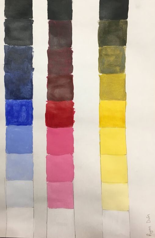
This is my value chart were we mixed the primary colors with black and white to get the tints and shades.
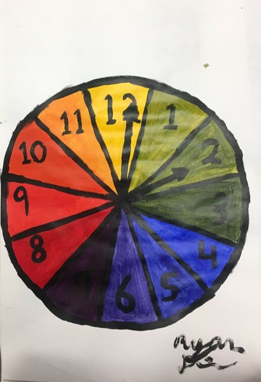
This is my color wheel where we mixed the primary colors to get all the other colors on the color wheel.
Banana
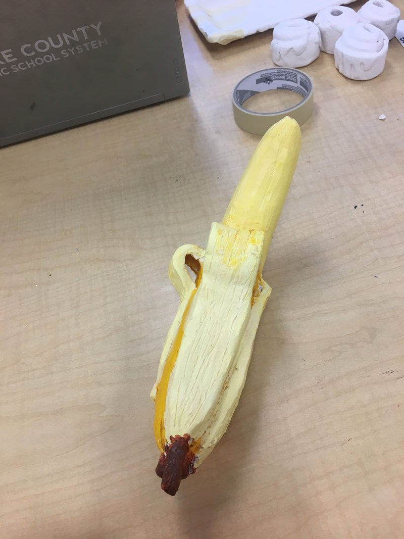
- Describe the craftsmanship of your sculpture. (Is it neat and well executed?)
2) What was the most difficult part of this project?
The texture was the most difficult part of the project. It was hard to figure out how to make it real.
3) Did your color choices work together harmoniously?
The color choices were basic but it was good enough. I could have made it better if I spent a little more time on it.
4) Is your sculpture interesting from all views?
Yes my sculpture is 3D. All of the sides look good and are interesting.
5) Describe the differences in constructing a sculpture and doing something 2D.
Constructing something 3D is tougher because you have to be conscious when painting one side to not mess up another side. Its also tough cause you have to gently set it down so it doesn’t mess up one side.
6)How did you create textures in your sculpture?
I used my hands to make textures. The banana peel didn’t work.
7) Does your sculpture look like the actual food? How did you accomplish this?
Yes my sculpture looks real. I did this by painting it yellow.
8) What would you do differently if you were to do this project again?
I would make something a little easier. The banana kept cracking over night.
Art Class Final Critique
Overall, I felt the class was fun and I learned a lot. I enjoyed the projects for the most part, but some of them were difficult so I should have taken art 1 first. I think that would have given me better success in this class. My least favorite project was the pen and ink unit. Next year I would use a smaller paper because many people did not finish. I also wish there was a different way to turn in work because Weebly is difficult to work with. It is tough to size the images and make the page look clean and orderly. My favorite project was clay and I wish we could’ve done the painting project as well. Next year I would make more serious deadlines rather than have everything roll until the end of the quarter.
